
About the Write-up
AI has transformed the way digital products are designed. Today, anyone can generate polished interfaces, landing pages, or dashboards within minutes. While this has accelerated development, it has also introduced an unexpected challenge. Products built with entirely different AI tools often end up looking surprisingly similar.
This edition explores why that happens. We examine how shared design systems, training data, and statistical prediction influence modern interfaces, and why creating products with a distinct identity now requires more than simply writing better prompts.
Why Every AI-Built App Is Starting to Look the Same
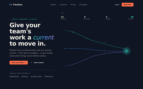
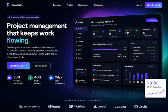
Open a few AI-generated websites and something feels familiar before you even start reading. The hero section is perfectly centered. The typography feels clean and safe. The buttons sit neatly below the headline. Cards have soft rounded corners, generous spacing, and subtle gradients.
Whether the interface comes from ChatGPT, Claude, Grok, or another AI tool, the design language often feels almost identical.
The output is not bad. In fact, it is usually polished, functional, and ready to use. The real question is whether it feels unique.
The more you refine an AI-generated design, the more you may notice another pattern. Instead of becoming more distinctive, it often moves closer to what already exists. After several rounds of "make it better" or "make it more modern," the result starts blending into countless other AI-generated products.
That raises an important question. If different tools consistently produce similar interfaces, where does originality come from?
We've Been Here Before
This may seem like a challenge unique to AI, but the design industry has experienced similar moments before.
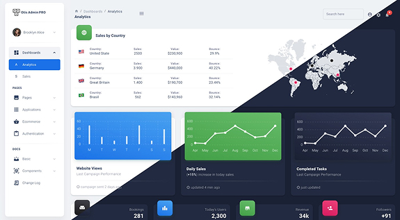
When Bootstrap became widely adopted, it helped developers build interfaces faster than ever. Within a few years, startups everywhere began sharing the same visual identity. A familiar grid system, blue primary buttons, and predictable navigation patterns became the norm. Saying "it looks like Bootstrap" quietly became another way of saying it lacked personality.
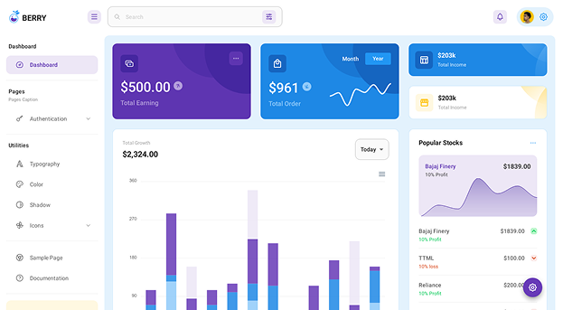
Material Design followed a similar path. Google introduced it as a thoughtful design philosophy built around usability and consistency. Yet many teams adopted only its visual components while overlooking the principles that made the system effective in the first place.
AI-generated design takes this pattern one step further.
Bootstrap and Material Design were frameworks that teams consciously chose to adopt. AI-generated interfaces begin from defaults that are already embedded within the models themselves. Those defaults are shaped by training data, popular component libraries, and the patterns the models have learned to predict.
Even before the first prompt is written, the model already has an idea of what a "good" interface looks like.
That invisible starting point is much harder to recognize and even harder to move away from.
The Math Behind the Sameness
The reason AI-generated products often resemble one another is surprisingly simple.
When a model receives limited creative direction, it generates the most statistically probable result based on everything it has learned. In other words, it predicts what an average solution should look like.
The effect becomes even stronger because many AI tools rely on the same technical foundations. Frameworks like React, Tailwind CSS, and popular component libraries have become standard across modern development. As these technologies become more common, visual patterns naturally begin converging.
Iteration adds another layer to the problem.
Suppose you ask an AI to generate a landing page. The first version is clean and functional. You then ask it to improve the design.
The model uses its own previous output as the starting point for the next version. Since that first design was already close to the average, each revision moves slightly closer to the center instead of introducing a stronger point of view.
What feels like progress can gradually become convergence.
Anthropic has openly discussed this challenge. Their engineering teams have acknowledged that AI naturally produces layouts that are functional but visually predictable unless given stronger creative direction. Even with evaluation systems designed to reward originality, there are limits to what checklists can achieve.
Creativity is more than meeting design rules. A product can satisfy every usability guideline and still feel like something you've already seen before.
The Same Story in Steel and Concrete
Some of the strongest lessons about AI-generated design come not from software, but from architecture.
Designer Dieter Rams built Braun's products around ten timeless principles of good design. They emphasized clarity, simplicity, and function. Over time, however, many companies copied only the visual style without understanding the thinking behind it. Minimalism became an aesthetic rather than a deliberate design choice.
A similar story can be found closer to home.
When Navi Mumbai was planned as an extension of Mumbai, everything looked right on paper. Wide roads, organized sectors, and carefully planned residential blocks created a city that was efficient and functional.
What the master plan could not predict was the informal layer that gives every neighborhood its identity. The tea stall outside an office, the morning vegetable market, or the street corner where people naturally gather were never part of the blueprint. Yet these everyday interactions are what make a place feel alive.
AI-generated interfaces face the same challenge.
They can produce polished layouts, balanced spacing, and logical hierarchies with remarkable consistency. What they often miss is the human layer that creates personality and emotional connection. That sense of identity cannot simply be added at the end. It has to shape the design from the very beginning.
Why Leaving Is Hard
Breaking away from AI defaults is difficult because they rarely feel wrong.
The layouts are clean. The typography is readable. The spacing feels balanced. Everything appears professional enough to ship.
That creates a false sense of confidence. Since the design already looks polished, there is little motivation to question whether it actually reflects the product or the brand.
Iteration makes this even harder.
Each time we ask AI to "improve" a design, it typically refines its own previous output. Without stronger creative direction, every revision moves closer to familiar patterns rather than toward something original.
The result is a growing collection of products that work well but struggle to stand apart.
Architect Christopher Alexander warned about a similar problem decades ago. He believed great design could never be reduced to a checklist because its most important qualities come from judgment, context, and human experience. His concern was simple. A system can follow every rule and still fail to create something meaningful.
That observation feels just as relevant in the age of AI.
What You Can Actually Do About It
The good news is that originality is still possible. It simply requires giving AI stronger direction before it fills the empty space with its own assumptions.
Start with references, not requirements.
Instead of asking AI to "design a modern landing page," provide specific references and explain exactly what you admire in each one. Perhaps it is the typography from one example, the visual hierarchy from another, and the restrained color palette from a third. The more specific your inputs, the less AI relies on its own defaults.
Own your visual identity early.
AI is excellent at creating layouts and information hierarchy, but identity comes from branding elements such as typography, colors, spacing, and motion. Establish these decisions before you begin refining the design. If you wait until later, the AI's default style becomes increasingly difficult to replace.
Build a reusable design system.
For ongoing projects, your design principles should live within the product itself rather than inside a single conversation with an AI model. A documented design system gives every new generation a clear starting point based on your brand instead of the model's statistical average.
Ultimately, AI fills only the space that you leave undefined. The more intentional your constraints are, the more distinctive your output becomes.
The Irreducible Thing
AI has made professional-quality design accessible to almost anyone. What it has not replaced is the ability to decide what a product should feel like.
That decision comes from experience, observation, and a clear point of view. It is shaped by understanding users, making thoughtful trade-offs, and knowing when to challenge familiar patterns instead of following them.
AI can generate an interface.
It cannot generate taste.
That remains one of the most valuable contributions humans bring to the design process.
Looking Ahead
AI will continue to become faster, more capable, and more accessible. The challenge is no longer generating polished interfaces but creating products that feel intentional and memorable.
As more organizations adopt AI assisted design, the competitive advantage will shift from speed to originality. The teams that stand out will not be those using the most advanced tools, but those bringing the strongest creative direction to them.
The future of design is unlikely to be human versus AI. Instead, it will belong to teams that know how to combine AI's efficiency with distinctly human judgment.
Key Takeaways
AI generated interfaces often look similar because models learn from the same design patterns and technical foundations.
Without clear creative direction, every iteration naturally moves toward the statistical average.
Great design is shaped by context, judgment, and intentional constraints, not by aesthetics alone.
Defining your visual identity before using AI helps create more distinctive products.
AI can accelerate execution, but originality will always come from human perspective and thoughtful decision-making.